
|
stymingersfink
Apr 8, 2007, 5:48 AM
Post #1 of 15
(1974 views)
Shortcut
Registered: Aug 12, 2003
Posts: 7250
|
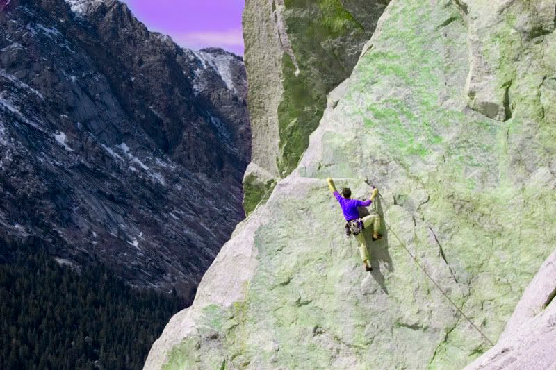
Uncropped
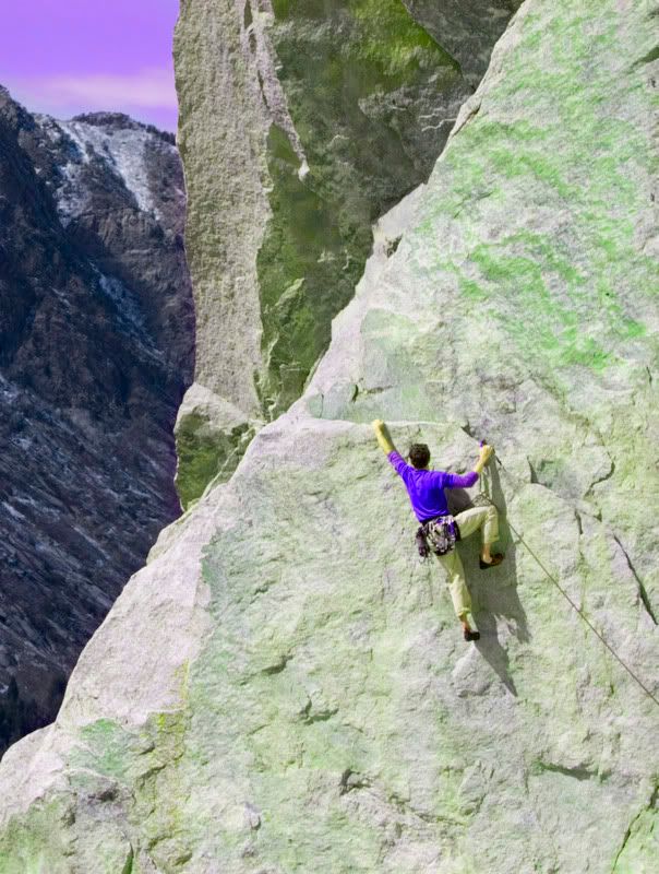
Cropped
Tweaked saturation a tad to show the green patina on the rock as it was when photo was taken.
Input?
|
|
|
|
|
herbaltee
Apr 8, 2007, 7:50 AM
Post #2 of 15
(1969 views)
Shortcut
Registered: Jan 16, 2006
Posts: 185
|
If you can tweak the saturation without changing the climber I think it would make a stronger picture. Right now it looks a tab bit manufactured.
I like the crop. I guess its true that the first crop is the deepest...heheh nice shot.
|
|
|
|
|
stymingersfink
Apr 8, 2007, 8:17 AM
Post #3 of 15
(1965 views)
Shortcut
Registered: Aug 12, 2003
Posts: 7250
|
i shaded the layer mask to neutralize the effect on his skin tones and the rope. I liked the changes in his shirt, which was more of a light blue to begin with. Now that you mention it (and the more I look at it) I suppose it might help to tone the shirt down a little as well.
anyone else?
|
|
|
|
|
 thespider
Apr 8, 2007, 1:50 PM
Post #4 of 15
(1958 views)
Shortcut
Registered: Jun 13, 2006
Posts: 471
|
I think the shirts a little too blue for my tastes.
I like how the cropped version has more rock impact. I feel that the climber is more challenged when you see the rock climbing up above o him.
The uncropped version is nice to see how much he has already overcome. It gives perspective with the trees an mountain line.
Both are nice IMO. They certainly make me want to see more of the route!
|
|
|
|
|
Paul_Y
Apr 8, 2007, 2:23 PM
Post #5 of 15
(1953 views)
Shortcut
Registered: Jan 7, 2007
Posts: 245
|
I like the uncropped version when viewed full size large. It's interesting how viewing impact changes with viewing size. In general I've noticed that the smaller the viewing size the larger the subject needs to be.
Your exposure is spot on and the details crisp.
When viewed large you can see that the skin tones are going a bit green so you might want to hold that area back as others have noted.
Nice work!
|
|
|
|
|
stymingersfink
Apr 8, 2007, 4:01 PM
Post #6 of 15
(1944 views)
Shortcut
Registered: Aug 12, 2003
Posts: 7250
|
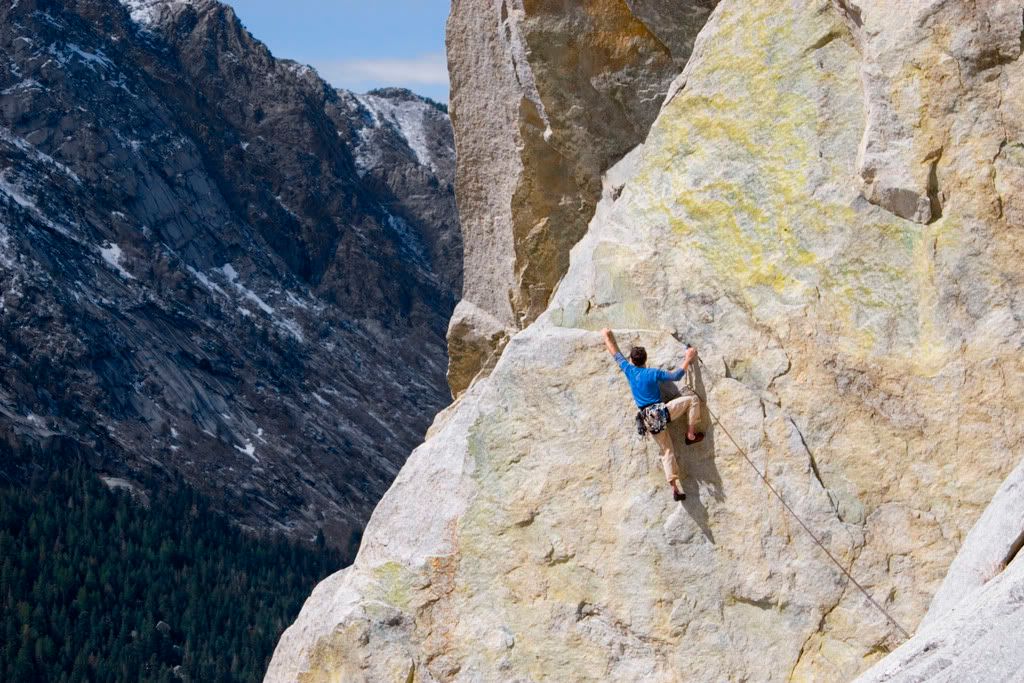
well, this time rather than pump the saturation as a whole and hold back on specific areas (as I did for the first one), I played with the channel hue to see if I could get close to the color I remember without breaking anything else.
less appalling?
|
|
|
|
|
Paul_Y
Apr 9, 2007, 2:36 PM
Post #7 of 15
(1921 views)
Shortcut
Registered: Jan 7, 2007
Posts: 245
|
It's a beaut!
|
|
|
|
|
stymingersfink
Apr 10, 2007, 2:43 AM
Post #8 of 15
(1898 views)
Shortcut
Registered: Aug 12, 2003
Posts: 7250
|
thespider wrote: They certainly make me want to see more of the route!
unfortunately, that is the route. though it continues for another pitch above and to the right. i think it is rarely climbed above the first pitch... It seems to be used as an access for people looking to work "all chalk and no action" on TR, a .12a(b?) bolted face climb that shares the anchor.
i think the arete above-left the climber is called "orange crush" .13b(?).
|
|
|
|
|
krillen
Apr 10, 2007, 1:41 PM
Post #9 of 15
(1890 views)
Shortcut
Registered: Jul 19, 2001
Posts: 4769
|
The second edit works MUCH better than the first. I looked at the pic with both myt CRT and LCD monitors (just to make sure it wasn't me) and the colours are crazy. The climber's skin went green as well as the rock, the sky and his shirt went purple, I wasn't sure if you were doign a Bruce Banner throw back or what?
Anyway, the second adjustment works well.
|
|
|
|
|
stymingersfink
Apr 12, 2007, 2:26 AM
Post #10 of 15
(1866 views)
Shortcut
Registered: Aug 12, 2003
Posts: 7250
|
i need to get something other than a laptop screen to work from, that's for sure.
and perhaps stop with the late-night editing?
|
|
|
|
|
8flood8
Apr 12, 2007, 4:03 PM
Post #11 of 15
(1850 views)
Shortcut
Registered: Nov 10, 2004
Posts: 1436
|
the 2nd edit is so much more crisp nice shot. hehe the green was making me feel weird!
|
|
|
|
|
sonyhome
Apr 13, 2007, 6:22 AM
Post #12 of 15
(1845 views)
Shortcut
Registered: Jul 5, 2005
Posts: 337
|
Honestly the first two edits are horrid. The last one feels much more natural.
It helps to come back after a long edit to get a fresh eye.
If cropping anything, I'd crop the route which is just flat and keep as much of the background on top-left. just use the slab for a strong composition geometry...
|
|
|
|
|
stymingersfink
Apr 13, 2007, 11:37 PM
Post #13 of 15
(1839 views)
Shortcut
Registered: Aug 12, 2003
Posts: 7250
|
in retrospect, i agree with you regarding the first edit... and the need to take breaks from such work on occasion
having the subject in the force-point of the frame gives me reluctance to crop at all, since in doing so I would need to do so proportionately thereby losing part of the left side background.
the crop from the first go round might work as a strictly climbing photo, but I like the landscape quality of the full frame, which is what I was going for when I shot it.
I'll probably crop it, then keep the two versions in iView...
|
|
|
|
|
kman
Apr 19, 2007, 2:04 PM
Post #14 of 15
(1767 views)
Shortcut
Registered: Oct 16, 2001
Posts: 2561
|
In reply to: well, this time rather than pump the saturation as a whole and hold back on specific areas (as I did for the first one), I played with the channel hue to see if I could get close to the color I remember without breaking anything else. less appalling?
Nice shot. Way better and more natural.
|
|
|
|
|
ryanpfleger
Apr 24, 2007, 8:19 PM
Post #15 of 15
(1719 views)
Shortcut
Registered: May 12, 2003
Posts: 243
|
I also like the last edit. The color on the first two was over the top for me. Cropping seems good, although I don't mind the landscape orientation as you get to see some background scenery.
|
|
|
|
|
|


