 |

sungam
Oct 10, 2009, 4:40 PM
Post #201 of 487
(23409 views)
Shortcut
Registered: Jun 24, 2004
Posts: 26804
|
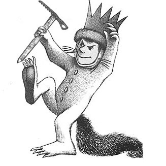
First attempt at making the axe look like part of the picture, the other one stood out too much. Does this suck even more or did I pull it off fairly well? Criticism please - I'm still learning this PS stuff.

|
|
Attachments:
|
 max1.jpg
(33.4 KB)
|
|
|
 |
 |

 angry
angry
Oct 11, 2009, 12:55 AM
Post #202 of 487
(23388 views)
Shortcut
Registered: Jul 22, 2003
Posts: 8405
|
It's not bad, my preference would be towards a reverse curve, that thing looks a bit too much like a garden tool.
|
|
|
 |
 |

cush
Oct 11, 2009, 3:54 AM
Post #204 of 487
(23368 views)
Shortcut
Registered: Oct 2, 2008
Posts: 320
|
i work at eastern mountain sports and we just got a pretty cool new shirt in today. it's a tree but all of the leaves are climbing gear. cams, ascenders, carabiners, quickdraws, ETC. it's pretty cool.
|
|
|
 |
 |

sungam
Oct 11, 2009, 11:18 AM
Post #205 of 487
(23347 views)
Shortcut
Registered: Jun 24, 2004
Posts: 26804
|
climbingtrash wrote: angry wrote: It's not bad, my preference would be towards a reverse curve, that thing looks a bit too much like a garden tool. I concur...maybe something like this would make it look less like a Pulaski... 
Yesh.
|
|
|
 |
 |

tradrenn
Oct 12, 2009, 4:30 AM
Post #206 of 487
(23312 views)
Shortcut
Registered: Jan 16, 2005
Posts: 2990
|
cush wrote: i work at eastern mountain sports and we just got a pretty cool new shirt in today. it's a tree but all of the leaves are climbing gear. cams, ascenders, carabiners, quickdraws, ETC. it's pretty cool.
Your post is worthless without pictures.
Just saying.
|
|
|
 |
 |

irregularpanda
Oct 12, 2009, 6:41 AM
Post #207 of 487
(23296 views)
Shortcut
Registered: Mar 13, 2007
Posts: 1364
|
sungam wrote: climbingtrash wrote: angry wrote: It's not bad, my preference would be towards a reverse curve, that thing looks a bit too much like a garden tool. I concur...maybe something like this would make it look less like a Pulaski... [image]http://www.rockclimbing.com/cgi-bin/forum/gforum.cgi?do=post_attachment;postatt_id=4197;[/image] Hmm, I see. Yesh.
This is the one I think.
sungam, magnus, whatever you call yourself...check your messages. PM sent.
|
|
|
 |
 |

sungam
Oct 12, 2009, 9:40 AM
Post #208 of 487
(23285 views)
Shortcut
Registered: Jun 24, 2004
Posts: 26804
|
irregularpanda wrote: sungam wrote: climbingtrash wrote: angry wrote: It's not bad, my preference would be towards a reverse curve, that thing looks a bit too much like a garden tool. I concur...maybe something like this would make it look less like a Pulaski... [image]http://www.rockclimbing.com/cgi-bin/forum/gforum.cgi?do=post_attachment;postatt_id=4197;[/image] Hmm, I see. Yesh. This is the one I think. sungam, magnus, whatever you call yourself...check your messages. PM sent.
|
|
|
 |
 |

dorienc
Oct 12, 2009, 10:47 PM
Post #209 of 487
(23238 views)
Shortcut
Registered: Aug 17, 2009
Posts: 49
|
sungam wrote: Good idea- that one would be popular in the peak district... Here's a little joke that has probably been done before but me and a buddy came up with in physics calss back in high school. A: Why can't you onsight anything in the Valley? B:Cuz the granite gives you beta, man! (granite emits beta radition in extremely small amounts...) Har har har... right?
OH man, climbing AND physics combined in one grand festival of geek hood! I love you, man!
|
|
|
 |
 |

sungam
Oct 12, 2009, 10:50 PM
Post #210 of 487
(23237 views)
Shortcut
Registered: Jun 24, 2004
Posts: 26804
|
dorienc wrote: sungam wrote: Good idea- that one would be popular in the peak district... Here's a little joke that has probably been done before but me and a buddy came up with in physics calss back in high school. A: Why can't you onsight anything in the Valley? B:Cuz the granite gives you beta, man! (granite emits beta radition in extremely small amounts...) Har har har... right? OH man, climbing AND physics combined in one grand festival of geek hood! I love you, man!  sorry, I'm taken. sorry, I'm taken.
|
|
|
 |
 |

Alpinisto
Oct 14, 2009, 12:00 AM
Post #211 of 487
(23201 views)
Shortcut
Registered: May 11, 2007
Posts: 118
|

Maybe draw in an Ecrin Roc instead of the crown?
|
|
|
 |
 |

sungam
Oct 14, 2009, 7:48 AM
Post #212 of 487
(23166 views)
Shortcut
Registered: Jun 24, 2004
Posts: 26804
|
Alpinisto wrote: [image]http://www.rockclimbing.com/cgi-bin/forum/gforum.cgi?do=post_attachment;postatt_id=4197;[/image] Maybe draw in an Ecrin Roc instead of the crown?
Plus, it takes away from the originial image too much.
|
|
|
 |
 |

sungam
Oct 14, 2009, 2:25 PM
Post #213 of 487
(23141 views)
Shortcut
Registered: Jun 24, 2004
Posts: 26804
|
Here's one.
Over the left breast it has max and on the back, this:

I could produce a few that had "SWHA" under the pic of max (or instead of it) if people were interested...
|
|
|
 |
 |

lockeyaaron
Oct 14, 2009, 2:36 PM
Post #214 of 487
(23137 views)
Shortcut
Registered: Sep 12, 2004
Posts: 649
|
I could would buy one that said SWHA on the left breast and then the MTNRS Commandments on the back. You aren't going to just photo-copy that picture on the back are you? It would look much better I think if it was actually typed out so it could be read.
|
|
|
 |
 |

sungam
Oct 14, 2009, 2:49 PM
Post #215 of 487
(23130 views)
Shortcut
Registered: Jun 24, 2004
Posts: 26804
|
I'll sharpen it up in PS, but I like the old peice of paper look about it - what do other people think?
|
|
|
 |
 |

lockeyaaron
Oct 14, 2009, 2:59 PM
Post #216 of 487
(23128 views)
Shortcut
Registered: Sep 12, 2004
Posts: 649
|
sungam wrote: I'll sharpen it up in PS, but I like the old peice of paper look about it - what do other people think?
If you can get it sharpened up or find a better picture of it I think it would look fine.
|
|
|
 |
 |

donald949
Oct 14, 2009, 11:33 PM
Post #217 of 487
(23099 views)
Shortcut
Registered: May 24, 2007
Posts: 11455
|
sungam wrote: I'll sharpen it up in PS, but I like the old peice of paper look about it - what do other people think?
It would be better if it didn't have the 3 hole punch, and had a larger boarder. The writting right next to the edges in annoying.
Also, the color of the paper would look good on a navy blue or black shirt. Might be fine on a white. But would clash with a number of other colors.
All right, I've lost it, SWHA?
|
|
|
 |
 |

kriso9tails
Oct 15, 2009, 2:49 AM
Post #218 of 487
(23069 views)
Shortcut
Registered: Jul 1, 2001
Posts: 7772
|
I took a couple of minutes to create a mockup, but I want to be perfectly clear: I have no intention of contributing to the productivity of this thread; I just want to add to the numerous breast references that must have already been made.

note that it would be a better design if that was a cam in his hand and not some sort of creepy phallus
(This post was edited by kriso9tails on Oct 15, 2009, 2:50 AM)
|
|
Attachments:
|
 Untitled-1.jpg
(37.0 KB)
|
|
|
 |
 |

JasonsDrivingForce
Oct 15, 2009, 3:06 AM
Post #219 of 487
(23059 views)
Shortcut
Registered: Apr 3, 2009
Posts: 687
|
sungam wrote: Just for the record, call me magnus. I wish I had made my username that to stat with.
There is an Indian store right next to TRC called SUNGAM. Next time you are in the states we need to get a picture of you climbing the sign!
|
|
|
 |
 |

sungam
Oct 15, 2009, 11:20 AM
Post #220 of 487
(23026 views)
Shortcut
Registered: Jun 24, 2004
Posts: 26804
|
donald949 wrote: sungam wrote: I'll sharpen it up in PS, but I like the old peice of paper look about it - what do other people think? The old paper is nice but. It would be better if it didn't have the 3 hole punch, and had a larger boarder. The writting right next to the edges in annoying. Also, the color of the paper would look good on a navy blue or black shirt. Might be fine on a white. But would clash with a number of other colors. All right, I've lost it, SWHA?
|
|
|
 |
 |

sungam
Oct 15, 2009, 11:20 AM
Post #221 of 487
(23026 views)
Shortcut
Registered: Jun 24, 2004
Posts: 26804
|
JasonsDrivingForce wrote: sungam wrote: Just for the record, call me magnus. I wish I had made my username that to stat with. There is an Indian store right next to TRC called SUNGAM. Next time you are in the states we need to get a picture of you climbing the sign!   
|
|
|
 |
 |

sungam
Oct 15, 2009, 11:21 AM
Post #222 of 487
(22998 views)
Shortcut
Registered: Jun 24, 2004
Posts: 26804
|
kriso9tails wrote: I took a couple of minutes to create a mockup, but I want to be perfectly clear: I have no intention of contributing to the productivity of this thread; I just want to add to the numerous breast references that must have already been made. [img]http://www.rockclimbing.com/cgi-bin/forum/gforum.cgi?do=post_attachment;postatt_id=4208;[/img] note that it would be a better design if that was a cam in his hand and not some sort of creepy phallus
|
|
|
 |
 |

donald949
Oct 15, 2009, 2:30 PM
Post #223 of 487
(22977 views)
Shortcut
Registered: May 24, 2007
Posts: 11455
|
sungam wrote: donald949 wrote: sungam wrote: I'll sharpen it up in PS, but I like the old peice of paper look about it - what do other people think? The old paper is nice but. It would be better if it didn't have the 3 hole punch, and had a larger boarder. The writting right next to the edges in annoying. Also, the color of the paper would look good on a navy blue or black shirt. Might be fine on a white. But would clash with a number of other colors. All right, I've lost it, SWHA? Stinky Would Have Approved.
Thanks.
|
|
|
 |
 |

kriso9tails
Oct 15, 2009, 5:21 PM
Post #224 of 487
(22958 views)
Shortcut
Registered: Jul 1, 2001
Posts: 7772
|
Go for it. I'm not using it. With all the guys I've met who tell me how much they love climbing in the valley, I'm surprised that I've never seen this shirt idea before.
|
|
|
 |
|

|